


How can websites possibly keep up with the millions of screens out there?
The short answer is they can’t.
So how does a web page adapt responsively to the needs of a computer screen versus an iPad or Blackberry screen?
One of the ways is through responsive web design.
Responsive web design uses CSS media queries to serve different style properties depending on the screen size, orientation, resolution, color capability and other characteristics of the user’s device.
Using the responsive web design approach, a web page can adjust itself on the device it’s being displayed on.
See Responsive Web Design in Action
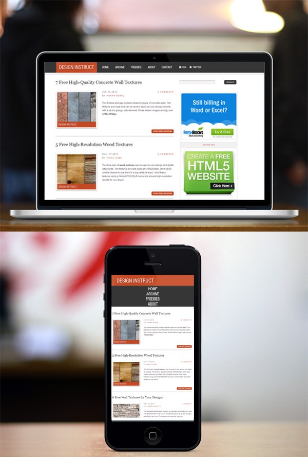
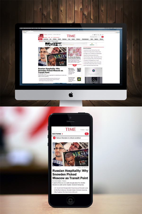
To see how responsive web design works, go ahead and access the Internet from your smartphone and browse through some sites listed on mediaqueri.es — an online gallery that features responsive web designs.
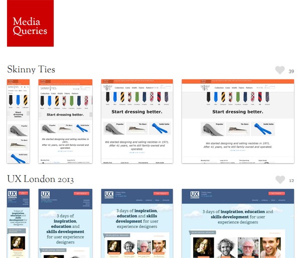
The mediaqueri.es home page
Now look at the same sites on another Internet-enabled device like your laptop or your iPad.
Notice how the web pages alter their layouts to fit the device you’re on.
Also, browse through some huge corporate sites such as Starbucks‘ and you’ll see responsive web design at work.
Determine if a Website is Responsive or Not on Your Computer Screen
You can quickly see if a website is responsive or not in your web browser.
If you resize your web browser to a smaller size, you’ll see the site’s layout re-fitting to the new window’s size in real-time.
Why Responsive Web Design Benefits Web Designers
Responsive web design relieves web designers, user interface designers, and web developers from working day and night creating websites for every single different device in existence. Here are a few benefits:
- One site for every device: Whether viewed on a 27-inch iMac with a wireless connection or from the screen of your Android phone with T-mobile 4G coverage, the website will be configured for the user’s optimal viewing pleasure.
- Optimal design for the device: With the responsive web design approach, all images, fonts and other HTML elements will be scaled appropriately, maximizing whatever screen size the user has.
- No need for redirects: Other options towards designing for multiple devices require the use of redirects to send the user to the appropriate version of a web page. Without the need for redirects, the user can access the content he wants to look at, as quickly as possible.
How to Get Started with Responsive Web Design
Here are resources that will help you build responsive web designs:
- Responsive Design in 3 Steps (webdesignerwall.com) — this wonderful tutorial distills responsive web design into a handful of steps
- Adaptive layouts with media queries (netmagazine.com) — this is a good responsive web design tutorial
- Responsive Web Design (alistapart.com) — the original article that debuted the concept of responsive web design
- Skeleton (getskeleton.com) — An open source web design boilerplate that will get you started with responsive web design quickly
Article from https://www.webfx.com/blog/web-design/creating-a-secure-website/